Shared living,
sorted
Acasa is a bill-splitting and shared-living expense app.
The redesign rebuilt it around financial clarity and trust, giving housemates a single, legible view of who owes what and why.
Year:
2025
Tools:
Figma
Category:
Fin-Tech
8 Weeks
End-to-end redesign, research through to
handoff-ready UI
6-8 Users
Full design system
Delivered as a scalable foundation for
future features

Problem
Shared living runs on shared money, and shared money runs on trust. Acasa’s existing experience undermined that trust in small, compounding ways: expenses were tracked but not clearly explained, individual versus group spending was hard to separate at a glance, and the app offered no insight into spending behaviour beyond a running list of transactions. None of this was a single broken feature. It was a structural gap between what the app recorded and what users actually needed to understand: not just what was spent, but what they personally owed, to whom, and why.
Content
Clarity had to come before features. Adding more functionality to a confusing foundation would have made the problem worse, not better. The redesign needed to fix legibility before anything else.
Financial apps run on trust, not just usability. A confusing balance screen doesn’t just frustrate users, it makes them question whether the numbers are even right. Visual design had to actively build confidence, not just look clean.
Group dynamics add a layer most expense apps ignore. Splitting a bill isn’t a solo task. The interface had to support the social reality of shared households, not just the math of expense splitting.
The system needed to scale. This wasn’t a one-off screen redesign. A consistent, documented design system was part of the brief, built to support features beyond the initial scope.
The existing app treated every expense as a transaction to log. But in a shared household, an expense is really a question: who owes what, and does that match what I expect? Acasa was answering the logging question well and the trust question not at all. Reframing the core job from “record this expense” to “show me where I stand” turned dashboard-style summaries from a nice-to-have into the actual centre of the redesign.
Solution
Redesigned Acasa around a dashboard-first structure that surfaces individual versus shared spending immediately, rather than requiring users to dig through transaction lists to understand their position. Core flows, expense logging, bill splitting, household overview, were simplified to reduce friction at the exact points where confusion was highest. A consistent visual system, with clear typography hierarchy and standardised components, was built to scale across future features rather than solving only the screens in scope.
My Role
→ Lead UI/UX Designer, end-to-end ownership
→ Directed research, flow redesign, visual design, and usability testing
→ Mapped and redesigned core flows: expense logging and splitting, household overview, individual contribution tracking→ Built and documented a scalable design system for use across future feature additions
→ Ran usability testing with 6–8 participants and iterated based on findings
Impact
Improved task clarity in expense tracking and bill splitting, observed directly in usability testing
Increased user confidence in managing shared finances, reported in post-test interviews
Positive response to the dashboard and financial insight views, specifically, the area users previously found most opaque
Key Decisions
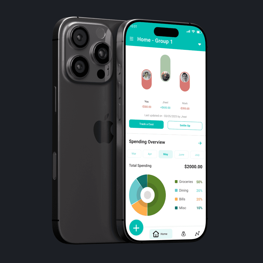
The original app led with a list of transactions and expected users to calculate their position from there. The redesign inverted that: a dashboard-style overview became the first thing users see, answering “where do I stand” before “what happened recently.” Transaction history still exists, but it’s no longer the primary lens the app is viewed through.
Knowing your share of a bill and seeing it clearly are different things. The redesign introduced a visual breakdown distinguishing individual from shared spending, rather than relying on labels and fine print within a combined list. This was one of the most consistently praised changes in testing, users described it as the point where the app started feeling honest.


It would have been faster to design the screens in scope and stop. Instead, time was spent establishing a documented, reusable design system, consistent components, spacing, and visual patterns, specifically so future features (budgeting, notifications, integrations) could be added without fragmenting the experience again. That decision extended the timeline but was treated as part of the actual deliverable, not a nice-to-have.
Deep Dive
Context
Acasa is a bill-sharing and shared-living expense management app. The existing experience worked at a basic level, expenses could be logged and split, but the surrounding context that makes shared finances trustworthy was missing. Users could see what was spent without easily understanding what they personally owed, and the app offered no insight into spending patterns over time. The brief was to rebuild the experience around clarity and confidence, not just functionality.
Problem Statement
“How might we simplify shared expense management while helping users make better financial decisions and trust what the app is telling them?”
Spending Clarity Was Missing
Users could see transactions but struggled to quickly understand their actual financial position.
Individual vs. Group Spending Was Blurred
Without a clear visual separation, users had to manually reason through what they personally owed.
No Behavioural Insight
The app recorded what happened but offered nothing that helped users understand or adjust their spending habits.
Fragmented Experience
Related actions were spread across the app inconsistently, adding friction to routine tasks like logging or settling an expense.
Research
Phase 01 — Mapping the Existing Experience
Audited Acasa’s existing flows and identified four recurring issues: unclear expense tracking, limited visibility into individual versus group spending, no behavioural insight, and a fragmented experience across related features. This was mapped in Miro to visualise where friction compounded across the user journey rather than treating each issue in isolation.
Phase 02 — Defining the Opportunity
Synthesised the audit into a single guiding question: how might we simplify shared expense management while helping users make better financial decisions. This framing deliberately pushed the redesign beyond a visual refresh and toward decision-support, not just data display.
Phase 03 — Usability Validation
Tested the redesigned prototype with 5–6 users. The clearest finding: users consistently preferred clear summaries over detailed transaction lists, and visual breakdowns of spending directly improved their understanding of where they stood financially. Simplified flows also measurably reduced confusion during bill-splitting tasks compared to the original structure.
Design Pillars
Clarity Builds Trust
In a financial app, confusion isn’t just a UX problem, it’s a trust problem. Every screen was designed to answer “where do I stand” without requiring interpretation.
Visual Summaries Over Raw Data
A clean breakdown of individual versus shared spending does more for decision-making than a complete, unsorted transaction history.
Reduce Friction in Group Interactions
Splitting and settling expenses needed to feel like a simple, low-stakes action, not a multi-step negotiation.
Design for What’s Next
A consistent, documented design system was treated as core scope, built to support future features without fragmenting the experience.
Features

Dashboard — Financial Overview — A first-screen summary of individual versus shared spending, replacing the original’s transaction-list-first structure.

Visual Spending Breakdown — Clear, immediate separation of what a user personally owes versus total household spending.

Simplified Expense Logging and Splitting — A reduced-friction flow for adding and settling shared expenses, redesigned after testing showed confusion in the original.
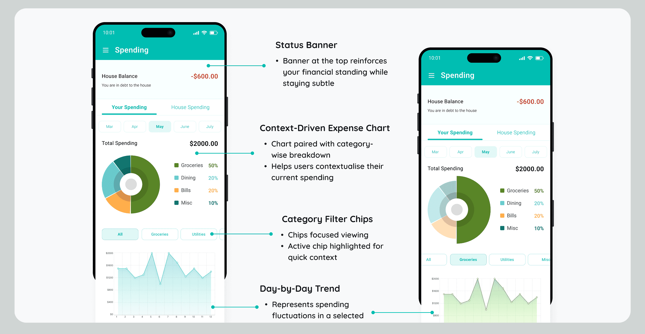
Household Overview— A consolidated view of group spending and contributions, designed to replace fragmented, multi-screen navigation.
Clarity is a trust feature, not a polish pass. This project reinforced that in financial products, visual clarity directly affects whether users believe the numbers. Treating the dashboard redesign as a trust problem, not a layout problem, changed which decisions felt non-negotiable versus which were genuinely cosmetic.
Scope discipline mattered more than scope size. Eight weeks is enough time to either polish a few screens deeply or spread thin across many. Choosing to build a documented design system, rather than just shipping the in-scope screens, was a bet that paid off in how coherent the final deliverable felt, but it meant saying no to a few additional flows that didn’t make the cut.
What I’d test next. All results here come from prototype-based testing, not live financial data. The open question is whether the visual clarity improvements hold up once real, messy, recurring household expenses are involved, rent, utilities, groceries, all with different splitting logic, rather than the cleaner scenarios used in testing.